As most of you are probably unaware (all five of you lovely readers), since I go to great lengths to hide it, Kevin
is an avid movie poster hoarder collector. His collections arrive weekly (ok that's an exaggeration...I think) in shiny tubes which are then carefully stored in the back of his bedroom, stacked vertically side-by-side, for eventual framing and displaying (one day).
I have dubbed this area the “poster metropolis,” with its various levels of tube heights resembling the skyline of a booming cosmopolitan town. Always growing, seemingly without end. Actually, a more appropriate analogy might be a Sim City nightmare come to life, but I'll let you decide.
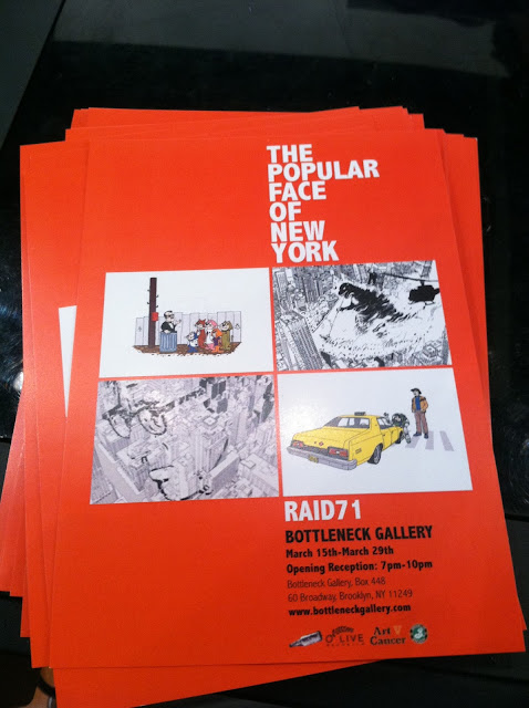
With that said, there's a small gallery in Williamsburg called The Bottleneck Art Gallery that showcases original prints and pieces from contemporary poster artists around the country with different collections every few months. Naturally, when the latest show opened a couple weeks back, we were just dying to check it out. And by we, I mean Kevin. I dutifully tagged along :) The current exhibit, entitled "The Popular Face of New York," features work by the artist Chris Thornley (known as Raid71) that takes inspiration from classic New York-centric movies like King Kong, Godzilla and Taxi Driver.
Getting to and from Brooklyn is never as simple as you expect despite the actual distance between the boroughs being less than a mile. Let's just say this particular journey across the river involved a lot of aimless waiting, mistaken train platforms, missed trains, and more waiting. I considered documenting this portion of the night, but furrowed brows and frustrated grimaces do not a good photo make. After finally emerging in Brooklyn, we made our way to the Bottleneck, where our recent travel woes were immediately forgotten and replaced with enthrallment... for one of us at least.
As we walked around the gallery, Kevin tried to introduce me to new terminology like “variant” (the variation on an original print, usually using different colors; e.g. the two Godzillas above) and “metallic ink” (do you care?), but most of it drifted over my head...I mean, completely registered, Kevin.
By the end of our perusing, self-described patron of the arts Mr. Schneider walked out with five new posters. New housing developments for the booming metropolis!
.


No comments:
Post a Comment